Devlog: January 12, 2023
Two small features today.
Sorting the credits by number of roles. So you see the person with the most credits at the top and the least at the bottom. This might be customizable in the future. For fun, I implemented Comparable to make this happen. Never done that before! Between that and needing Equatable too, I’ve never seen so much lhs and rhs in my life.
static func == (lhs: CombinedCredit, rhs: CombinedCredit) -> Bool {
    return lhs.id == rhs.id && lhs.name == rhs.name && lhs.roles == rhs.roles
}

static func < (lhs: CombinedCredit, rhs: CombinedCredit) -> Bool {
    let lhsCount = lhs.roles.first.count + lhs.roles.second.count
    let rhsCount = rhs.roles.first.count + rhs.roles.second.count
    if lhsCount == rhsCount {
        return lhs.name > rhs.name
    }
    return lhsCount < rhsCount
}
Those of you with a keen eye will notice that the name comparison is reversed. This is so the names appear alphabetical (when compared against another person with the same number of credits) despite the number of credits decreasing. Otherwise, names would be reverse alphabetical.
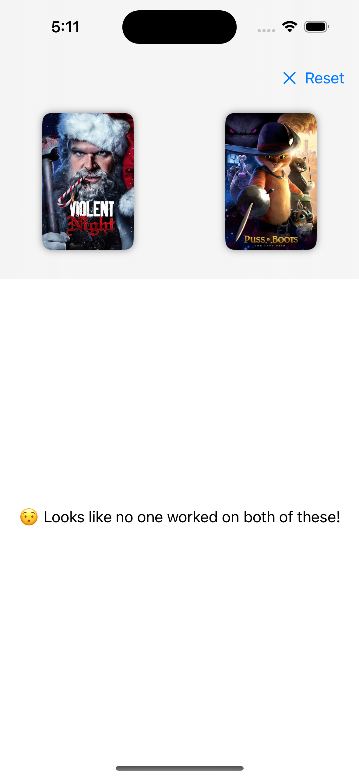
No matches found. Up until now, if you searched 2 things and no one worked on both, you’d see a lovely blank screen. No longer! Now you see a single line of small, boring text.
 Really? No one??
The design is obviously not great. That’s mostly on purpose. I’m trying something new with the project. I’m trying very hard to get features in and focus on polish later.
The wording is not great and the typography leaves something to be desired1. But I’m getting close to my original set of features. Then I can start polishing it up. After I figure out a name, I might even release it on TestFlight!
Speaking of naming, another thing I can’t quite figure out is what to call “Movies or TV Shows.” So far, “media” is the best word. But for some reason, I hate that. A lot. So I’m trying to think. Maybe I just say movies or TV shows when I need to refer to both. I’m not sure.
I also really dislike that clear button…↩︎