Devlog: February 3, 2023
Today’s feature is sorting. Initially, I hardcoded it to sort by number of credits, most to least. Thought it might be nice to let you wort the other way, and by name. The trickiest part of figuring out what UI to have for option. Right now, the best place is in my “more” menu. I went through a couple iterations though.
First
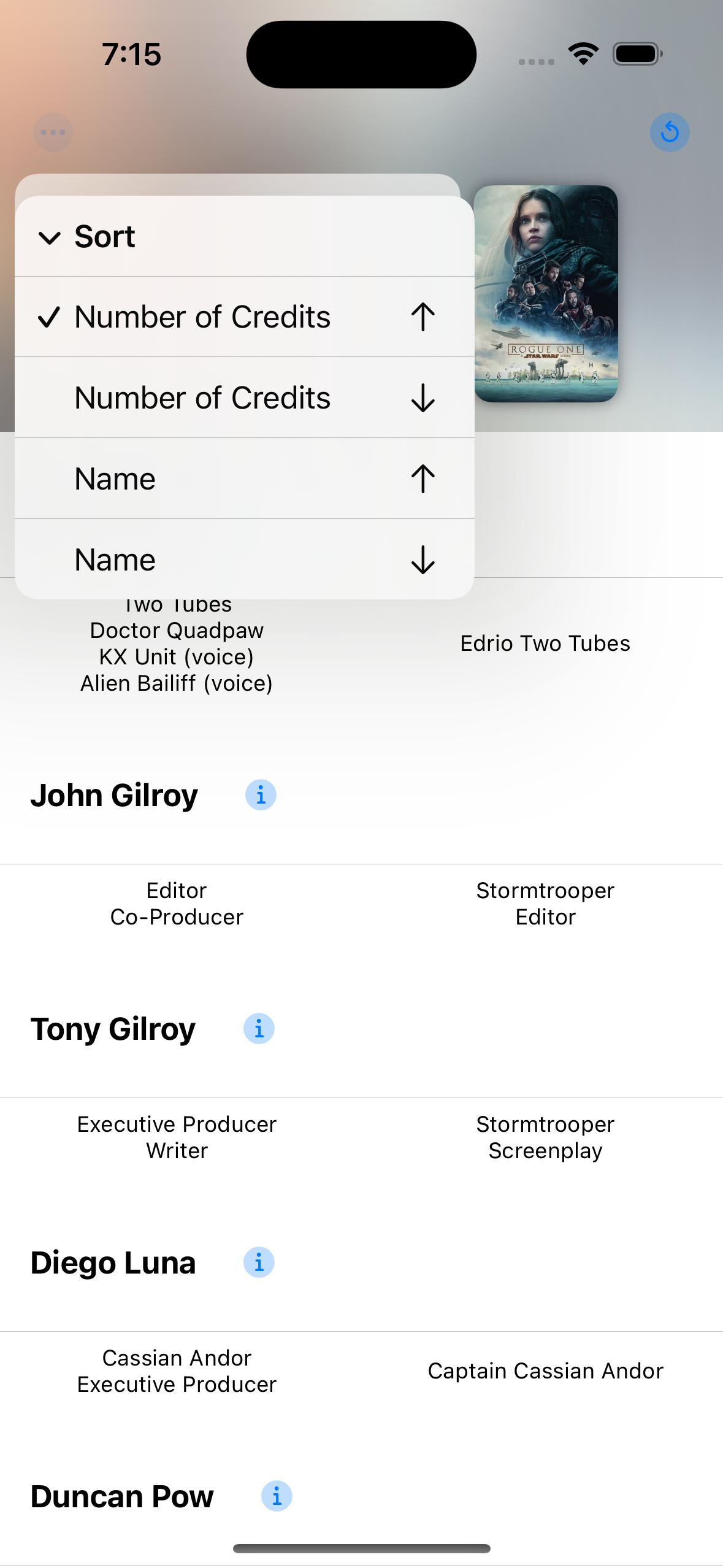
 Wall sort options
This was my first take. My instinct is to lay all the sort options out so they are easily accessible. Generally, I think this is a good idea. But here, it felt too repetitive, cluttered and, in my opinion, didn’t give enough information of what the sort actually was. Maybe if I could think of better labels and icons, it would work better.
Second
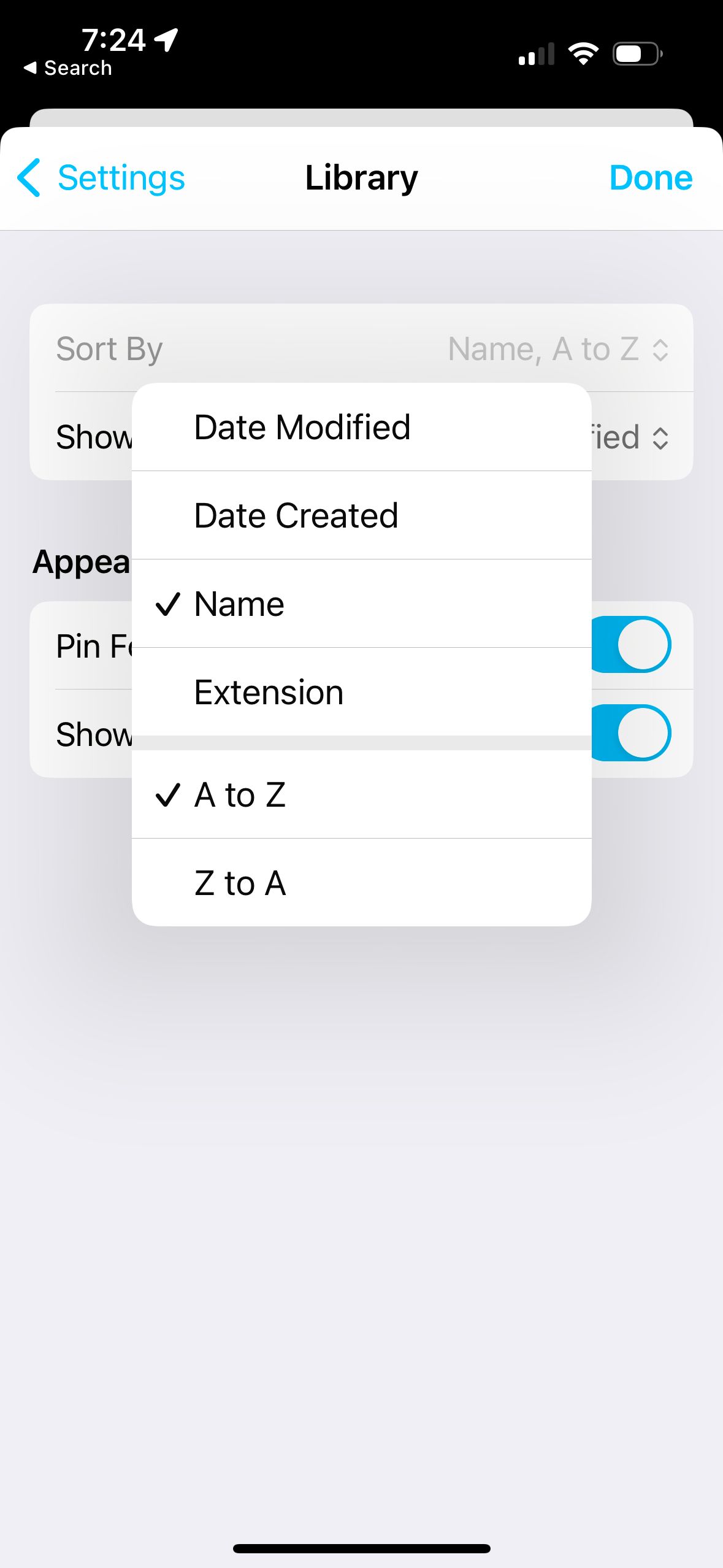
Looking for inspiration, I came across the sort options in iA Writer.
 iA Writer is a good app and we should emulate good apps right?
I like that it divides what you can sort by from the direct. This also lets you give really descriptive labels for the sort directions 👍1. So I went in that direction.
 Look familiar?
I like it! But, it has one crucial flaw—changing what you sort by immediately closes the menu, so you have to open it up again to change the direction. Not a great experience.
Third
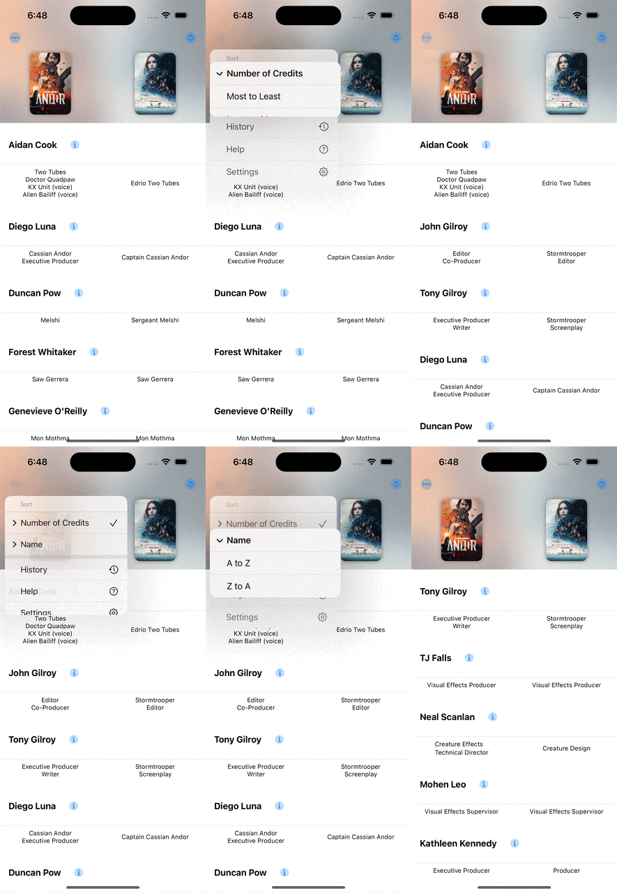
Okay. Too many taps. Can I make it less taps? What about more nested menus? Everybody likes that right?
 Better?
You have to really drill in, but you can get exactly the sort you want without too much fuss. Which I like better.
Final?
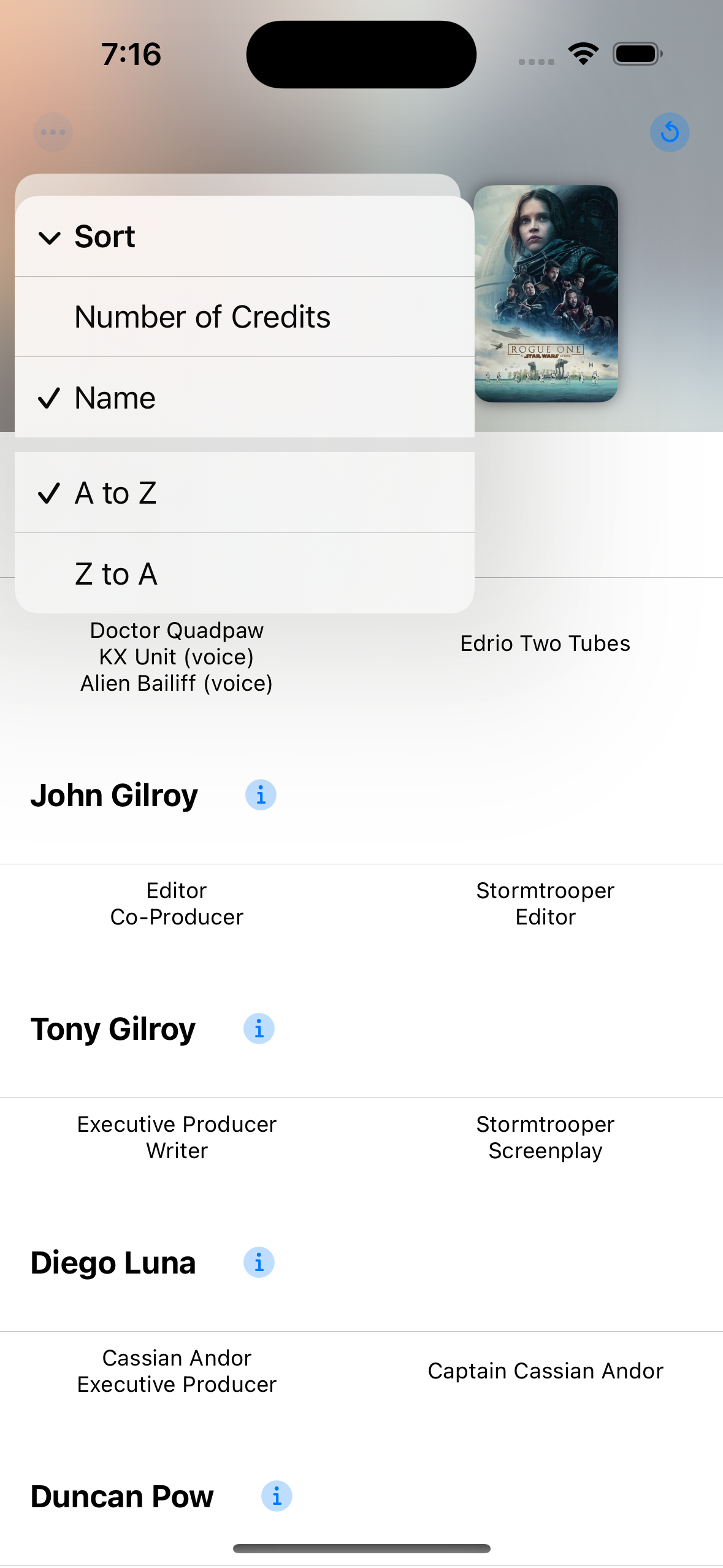
Then it hit me, why am I putting the options under a submenu. So I put them in their own section at the top level of the menu. This is my favorite so far and what I’m sticking with. Lets me keep the descriptive sort direction labels, doesn’t take up too much space, and doesn’t require too many taps. Plus it has a cute like section header.
 Just right...hopefully
I didn’t know you could put a section header in a menu. Here’s the code if it’s helpful at all.
Menu {
    Section("Sort") {
        Menu {
            Picker("Number of Credits", selection: $creditSort) {
                Text("Most to Least")
                    .tag(CreditSort.numCredits(.descending))
              Text("Least to Most")
                    .tag(CreditSort.numCredits(.ascending))
            }
        } label: {
            if case .numCredits(_) = creditSort {
                Label("Number of Credits", systemImage: "checkmark.circle")
            } else {
                Text("Number of Credits")
            }
        }
        Menu {
            Picker("Number of Credits", selection: $creditSort) {
                Text("A to Z")
                    .tag(CreditSort.name(.ascending))
                  Text("Z to A")
                    .tag(CreditSort.name(.descending))
            }
        } label: {
            if case .name(_) = creditSort {
                Label("Name", systemImage: "checkmark.circle")
            } else {
                Text("Name")
            }
        }
    }
}
This might not be the simplest way of doing this, but it’s straightforward, at least to me. Had to do some trickery to add a checkmark to the menu item to show a child is selected. Might clean that up later.
It was fun to iterate on this and figure out all the different ways I could do this. There’s a bunch of options I didn’t explore at all. Going to let this sit for a few days and see how it feels.
In general, ascending and descending mean almost nothing to be when it comes to sorting. I like it when it’s clear—A to Z, Z to A, etc.↩︎