Devlog: March 28, 2023
Mostly just screenshots today. I was working on making my suggested searches less boring. This is where I started:
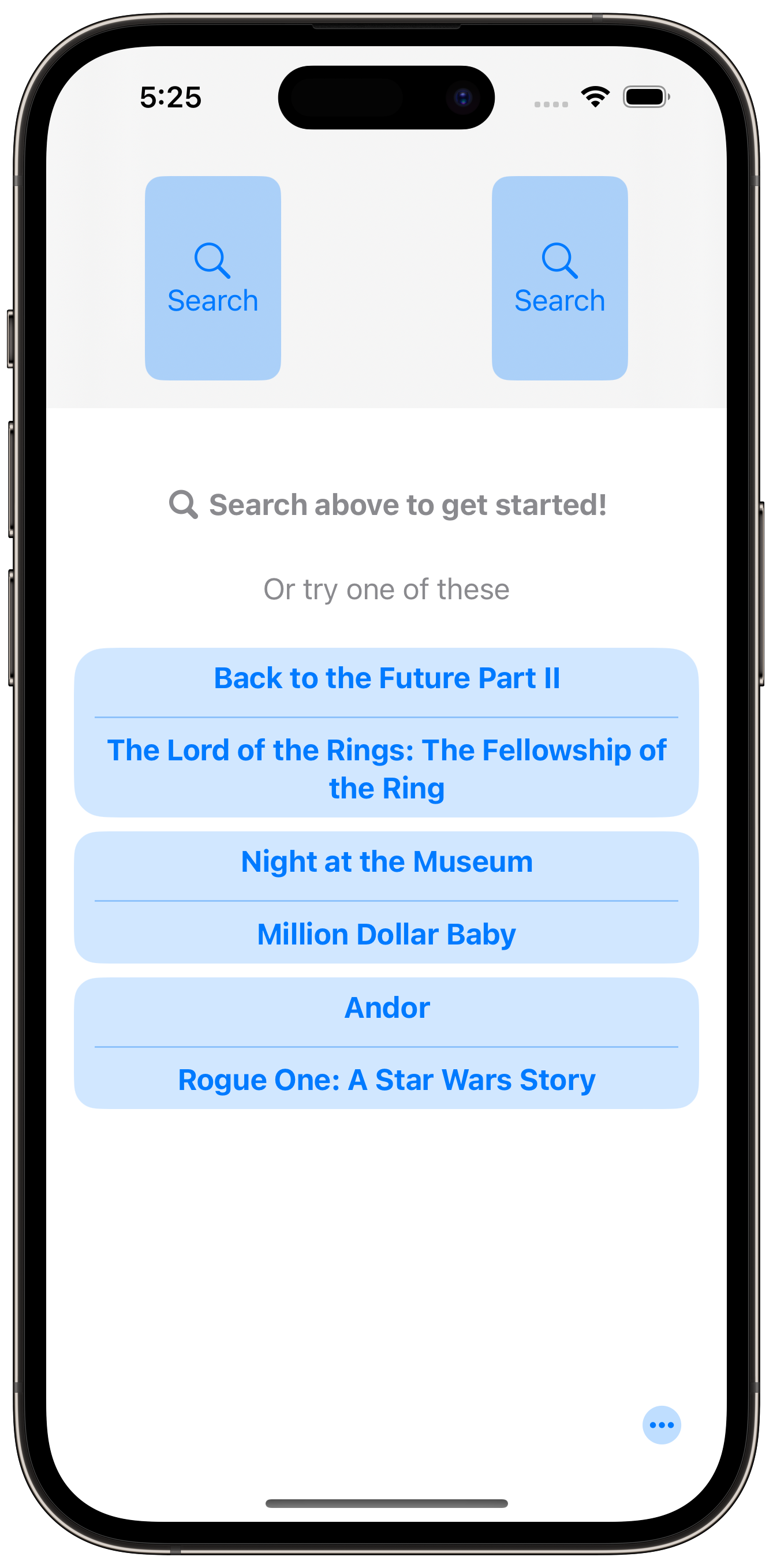 Boring
The alignment bothered me. Too much text.
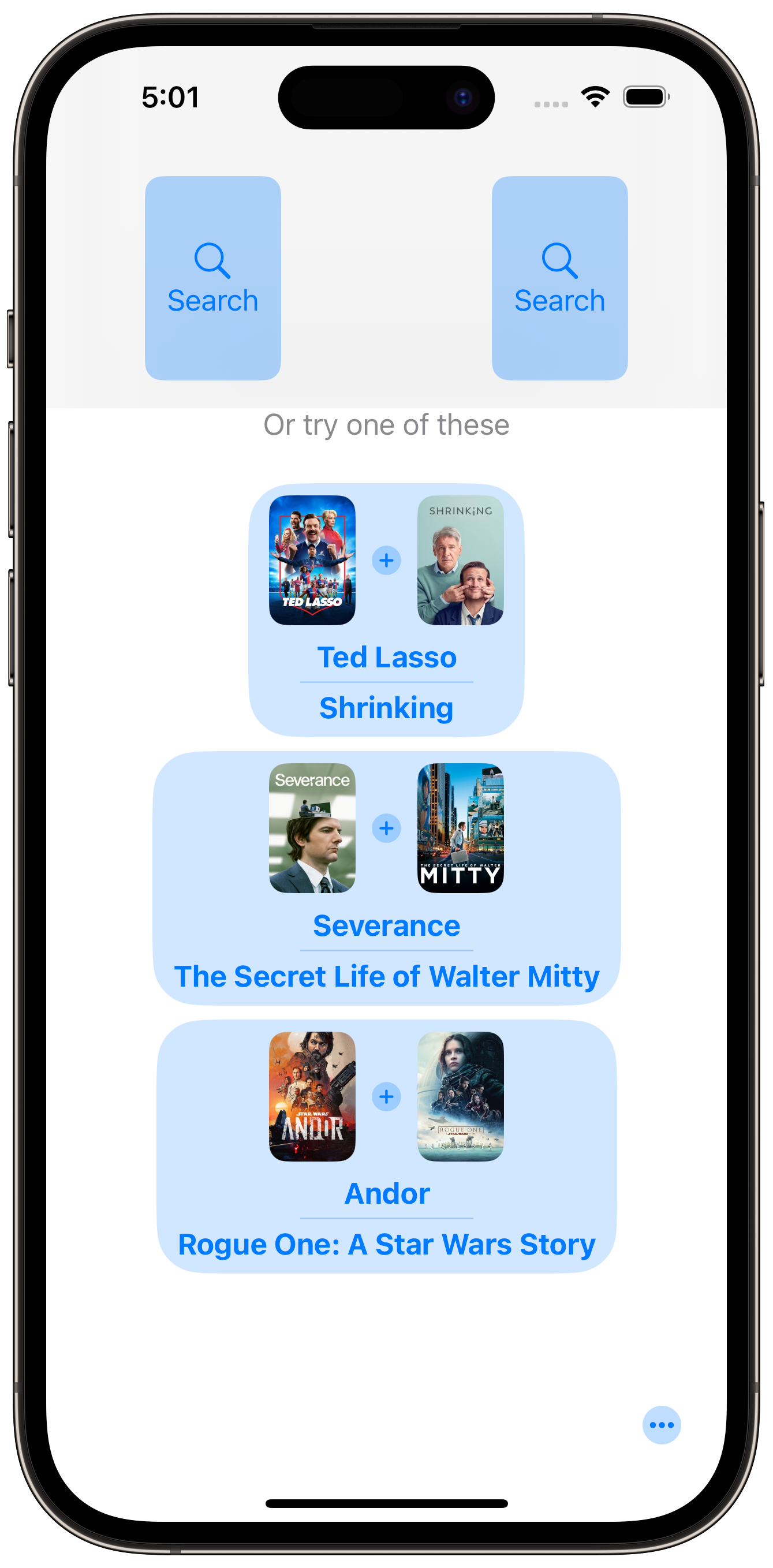 Images are nice
Next I tried adding images like I have on my history view. I quickly decided this was the right direction. But still had alignment issues and it felt too heavy.
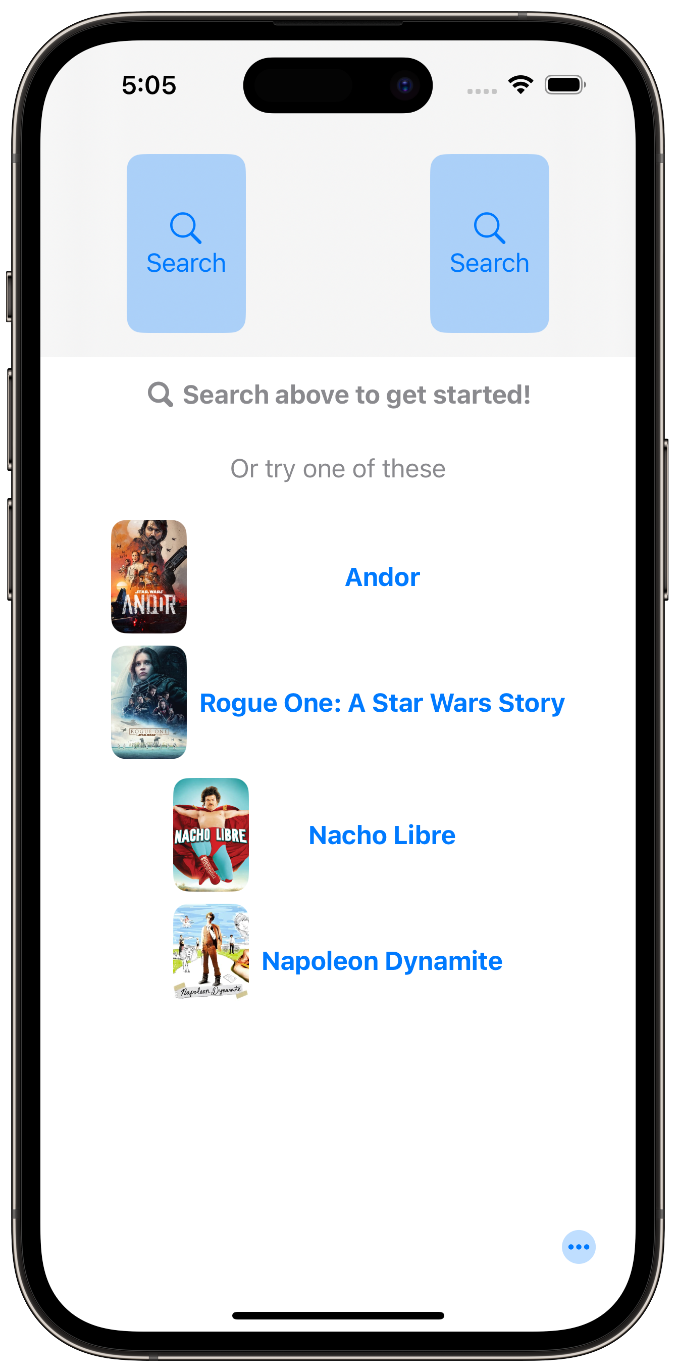 Wow so clean
Aligning the poster images with the titles felt like a step in the right direction. As well as removing the button background. But now, it’s not obvious what you should tap.
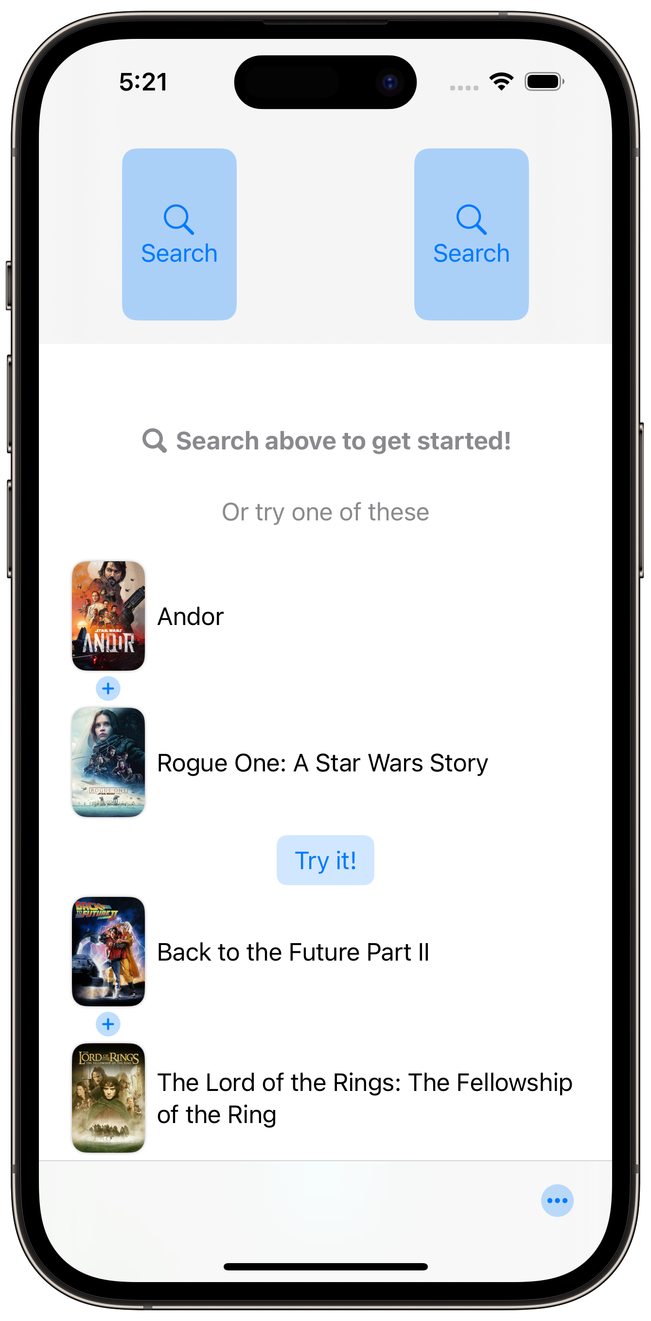 Closer
Add a dedicated button. Easy. The layout doesn’t feel quite right to me though.
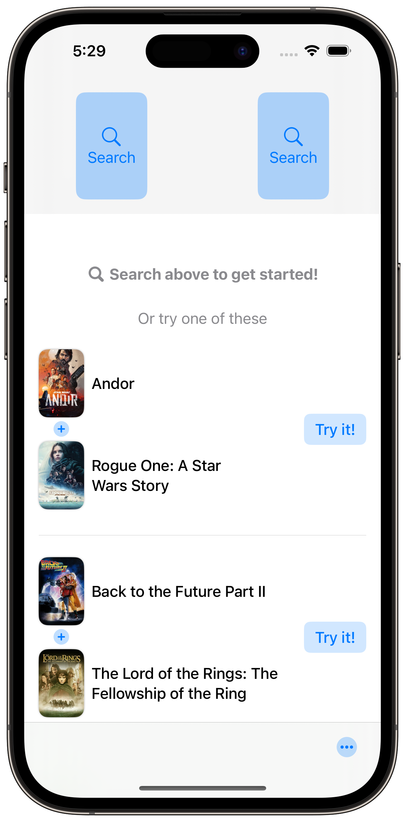 Actually happy with this
This is where I ended today. I’m quite happy with it. The divider creates clear separation as dividers often do. And I like the trailing alignment of the “Try it!” button.